
Week 12 – Pitch
Name of App: Interior Design Library
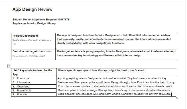
What the app is: A reference guide for Interior Designers
Why it is important: Generally in book form it is heavy, Lots of content, Time consuming, Extensive, we need to change that and make it compact, Organised, Quick, Easy to use.
How it is approached: By a mobile or iPad device.
Target Users – young, interior designers, unsure of terminology, needs a reference.
User Scenario – (As seen below under ‘updated’)
Features + Screenshots : Scroll up/down, Home button, Exit to home button, Left/Right arrows to next image, Page number/navigation, Menu located on bottom of screen.
Future Directions/Scope: Social sharing buttons, Use device functions, More content, More images.
Elevator Pitch
Hello!, Are you an interior designer? Do YOU forget the basics? If so, we have a solution for you! The Interior Design Library app is a quick and easy guide to the basic fundamentals of Interior Design. If you are unsure what your design is missing, we can help you! just look up our content and see what you need to apply to create the perfect room. In an organised and clean layout, you will find the answer in a matter of seconds. If that is what you are looking for, then try out our Interactive App, the Interior Design Library.
Week 11
An App Design Review
In conclusion the reviewees decided, that having a social meda share option would benefit the app marketing wise. Others agree not so much, as they deemed it unsuitable fro the use of the app.
Week 6 & 7
Logo and App design review

Feedback on Old Logo:
- “Cliched, using furniture silhouettes is outdated.”
- “If it had to be smaller, the chandelier will blur.”
- “Needs colour, a little boring.”


Chosen Logo Design

Feedback on New Logo:
- “Contrast is a good idea.”
- “Liked how the initials form a chair/furniture.”
- “Simple yet modern.”
- Clean, clear and if shrunken, easy to read.”
Week 4
User Scenario
Oringinal
The first user persona is an individual who is fresh to the interior design industry, aged early20’s, does not have many skills, in need of guidance and assistance. Which means a simple design will have her finding what she needs to find. The user is female and is rather shy, so rather than asking her teacher or emailing her teacher she wishes to pursue the information by herself. Her hobbies include drawing, designing, and creating new things. She has all of the text books but cannot be bothered going through all of the extensive texts set out in front of her. She is tech savvy and spends a lot of time on her mobile device. So rather than reading and wasting time she wants to find a quicker solution to help her with her interior design studies. First things she does is find an app on her phone.
Updated
A young aspiring Interior Designer, Sheridan, 19, is confused as to what “Rhythm” means, or what it’s key features are. Her teacher has used the principle many times in class during a design showcase. She opens up the app (Interior Design library), clicks Principles. It is the first of many principles she needs to learn, she reads its definition, and looks at the pictures and sees how it can be applied to interior design. Sheridan believes she understands its meaning and what it looks like. She now understands what her teacher has been saying in class.
Week 2 & 3
Unpacking an App Exercise 1: WESTERN
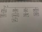
Information Architecture
Tools/modules in order (this is the default order, prior to being reorganised):
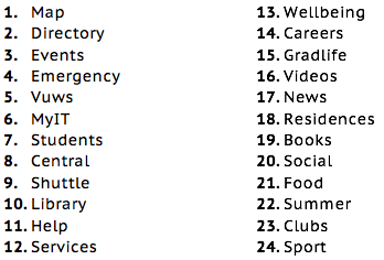
What is included in the app? List the tools/modules in order How do you think they are clustered/organized? – Can you suggest categories for the modules?
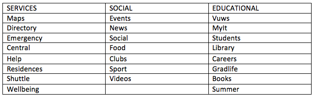
How are they clustered/organised and can you suggest categories for the modules?
The default layout for the app has the most time critical tools at the top of the first page, followed by other tools that students would regularly reach for. The second page has additional features that a student would not necessarily use. The app lacks categorisation and could be beneficial. It was discussed that some potential categories could include ‘Learn’, ‘Travel’, ‘Assistance’, ‘Social’, Health’ and ‘Services’.
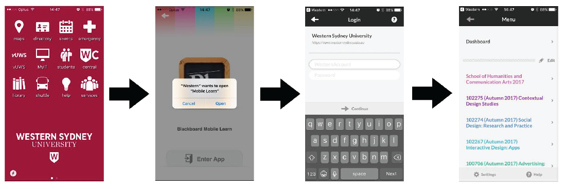
Site Flow: Western App
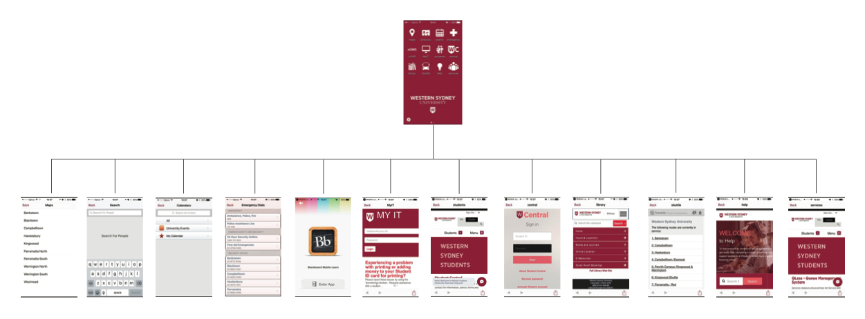
Make a quick site flow (map) of the app.

User experience (UX) flow
Choose a task a typical student might want to do, and map 1 user flow through the app.
Accessing vUWS.
Are there any tasks or activities missing from the app?
A checklist would be ideal for this app. A quick and easy checklist would help students maintain organisation and once the task is completed could be ticked off or crossed off the list.
Can you suggest anything else?
Street views would be beneficial for students who are new to the area as well as students who are unsure where to go.
User Interface
Is the app easy to use and navigate? What changes would you suggest?
The app is very basic and therefore relatively easy to navigate, however I did experience the following issues:
- I was unaware at first of the second page that once you slide across, could access. It wasn’t until I was fiddling with the app that I discovered that slide.
- A student identified and showed me that we could modify and rearrange the order of the icons.
However targeting navigation the app is easy to navigate and easy to read.
Visual Design
How do you describe the visual Design?
I describe the design as simplistic, boring as the images are 2-dimensional and simply red and white.
Does it match the university’s brand image?
Yes, the colour scheme of the muted red, the university’s “W” logo is prominent and captures the University’s branding perfectly.
What improvements could be made?
The design is basic and captures the University’s branding well, however the icons within the app could be made more colourful or even more dimensional.
Visual Design Remake


